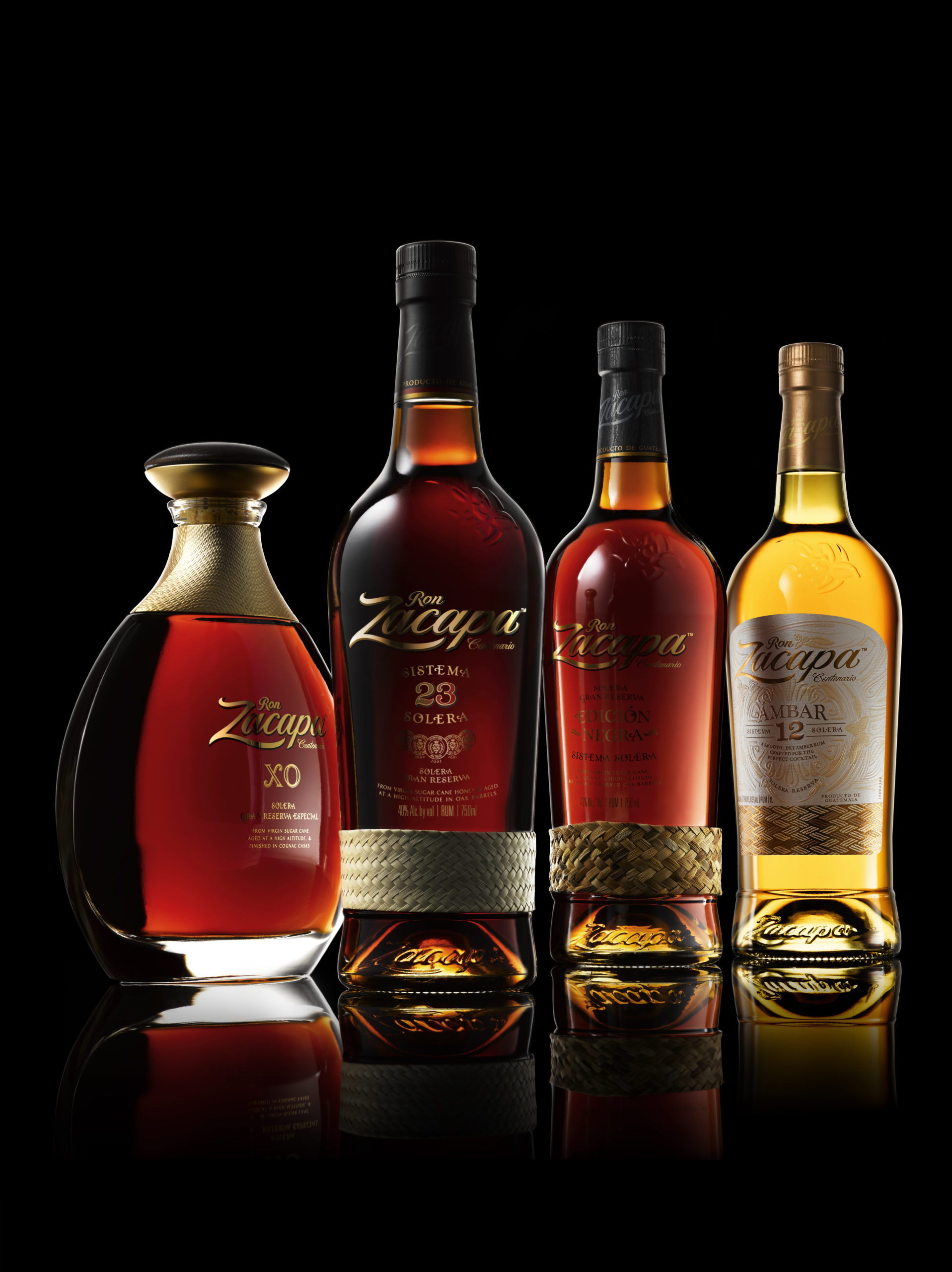
Eight years ago, the Zacapa team came to us to redesign their packaging. Our goal at the time was to elevate the brand perception – back then rum wasn’t considered a premium liquid. Zacapa is an incredibly rich brand. It is a work of art, an expression of patience, quality and passionate master blending. In the highlands of Quetzaltenango, 2,300 metres above sea level, where the air is cool and time slows down, Zacapa Rum ages slowly in the mystical House Above the Clouds – one of the highest ageing facilities in the world. Like cooking over a low flame, these conditions allow Zacapa to obtain exceptionally deep aromas, rich color and profound flavor.
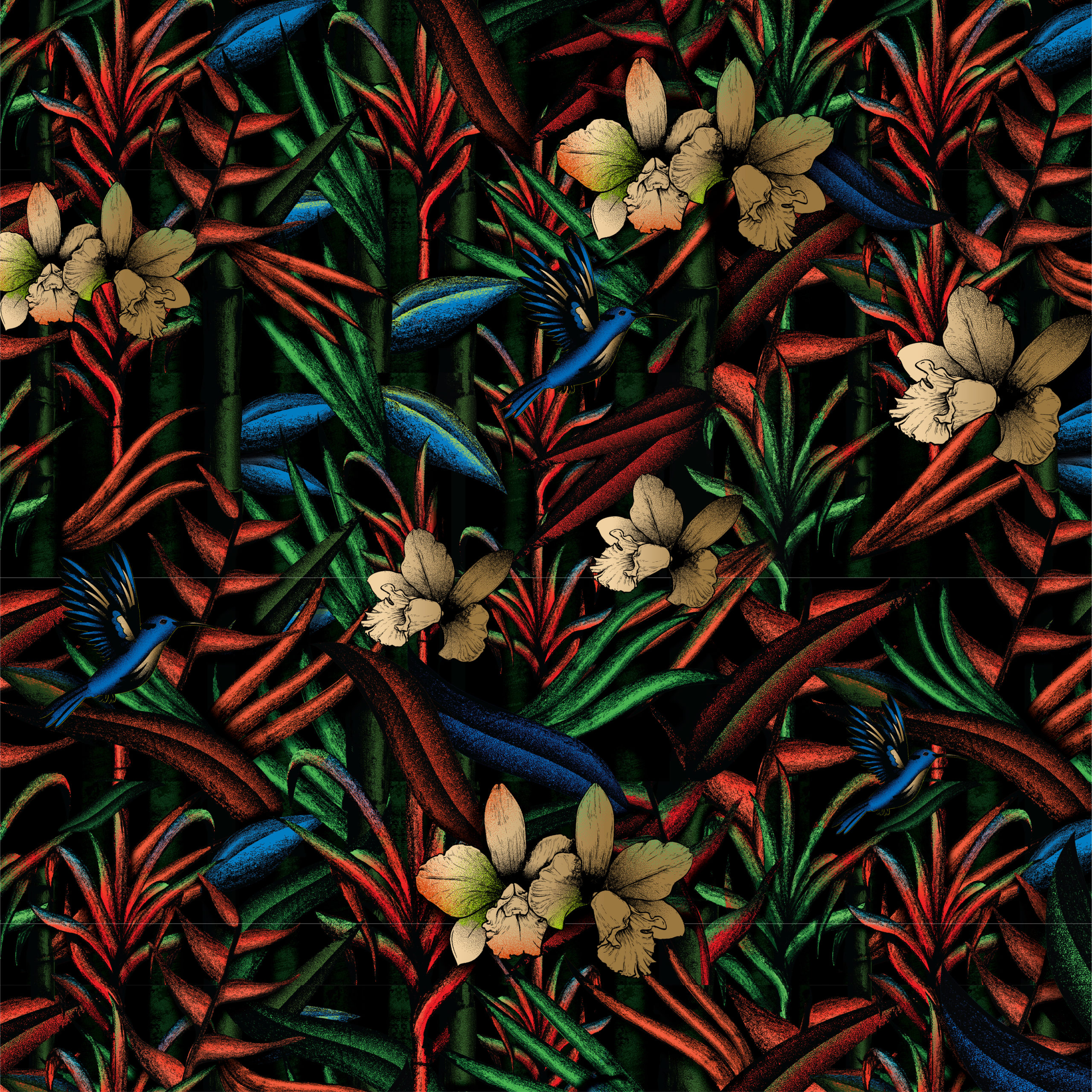
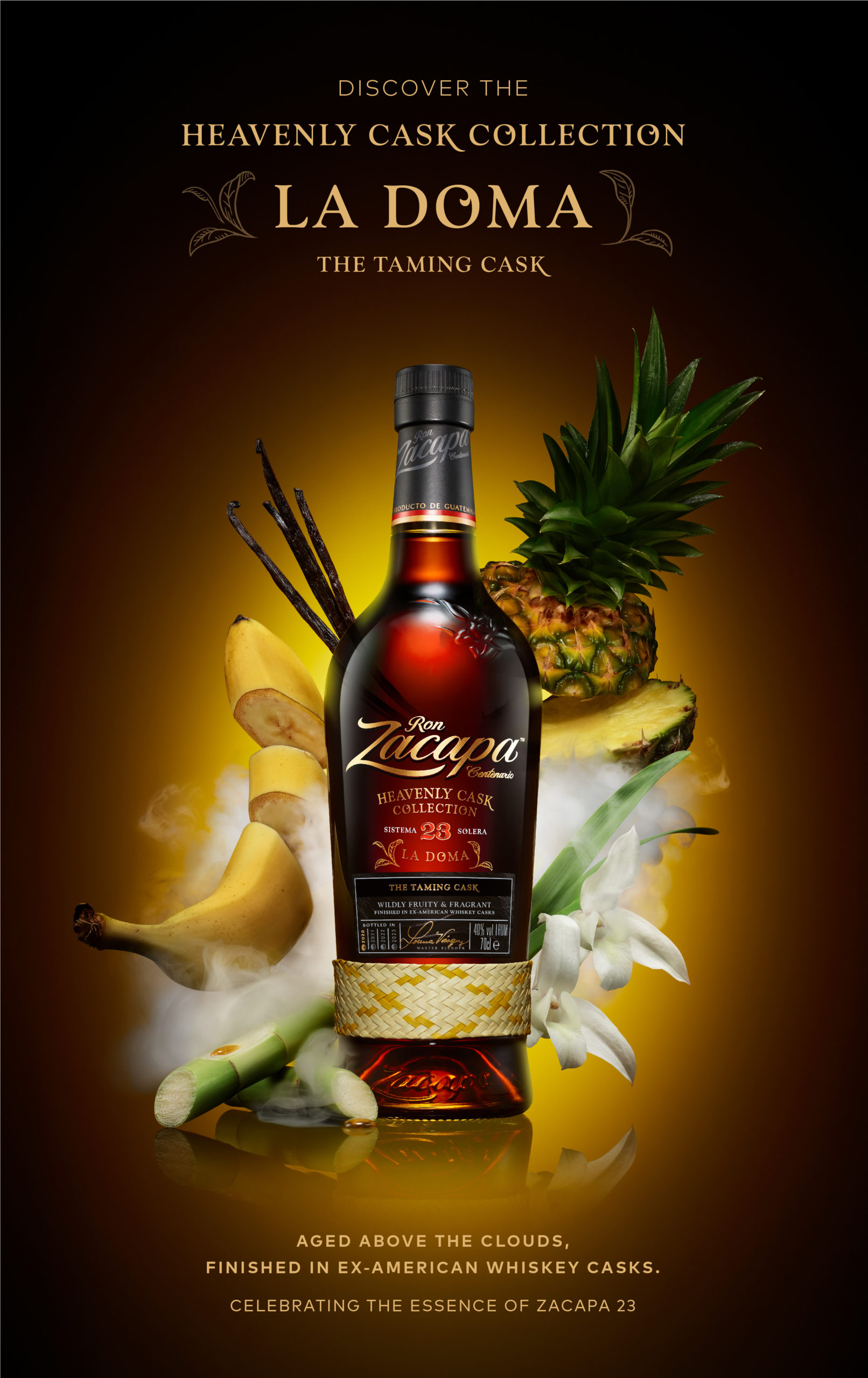
Since our first redesign work for Zacapa, we’ve been commissioned to create activations, spaces, and most recently, we were asked to develop their brand world. To build design principles and a brand language that would be carried across platforms.
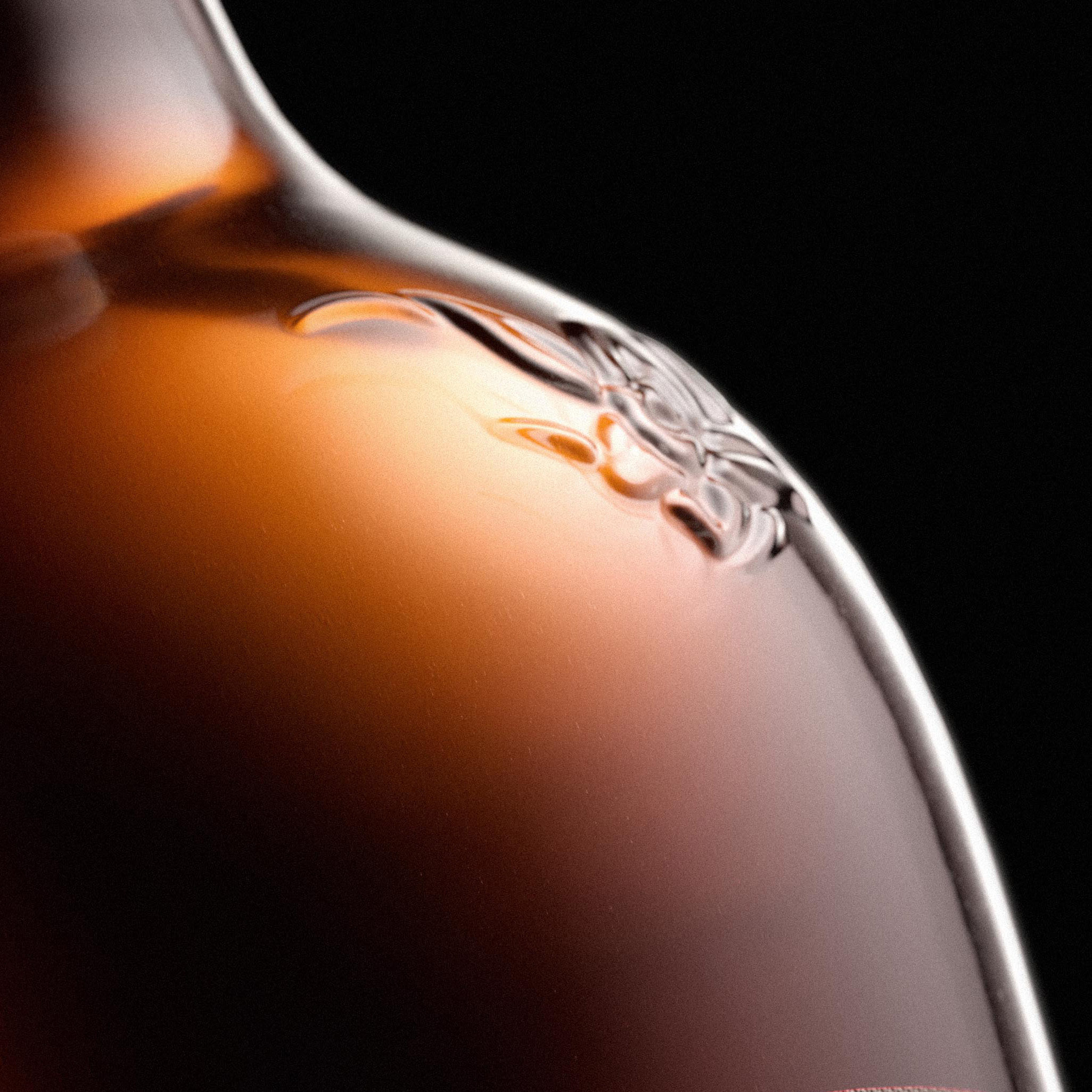
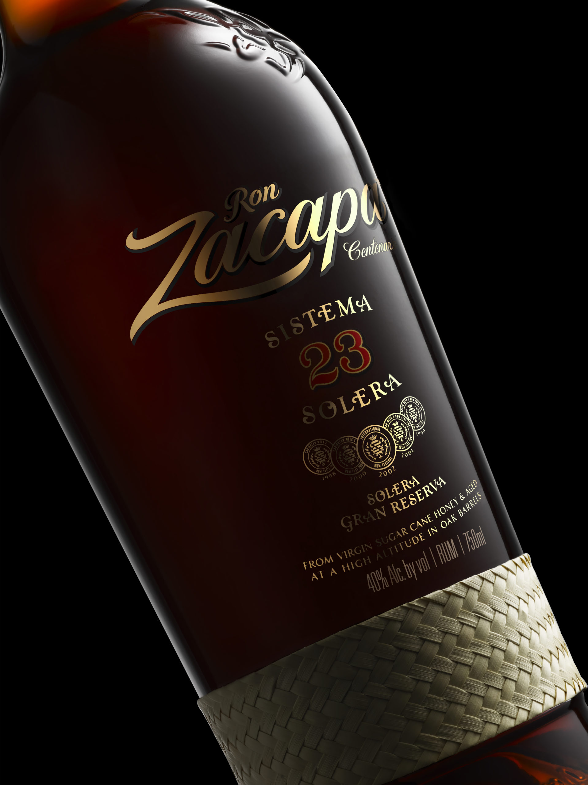
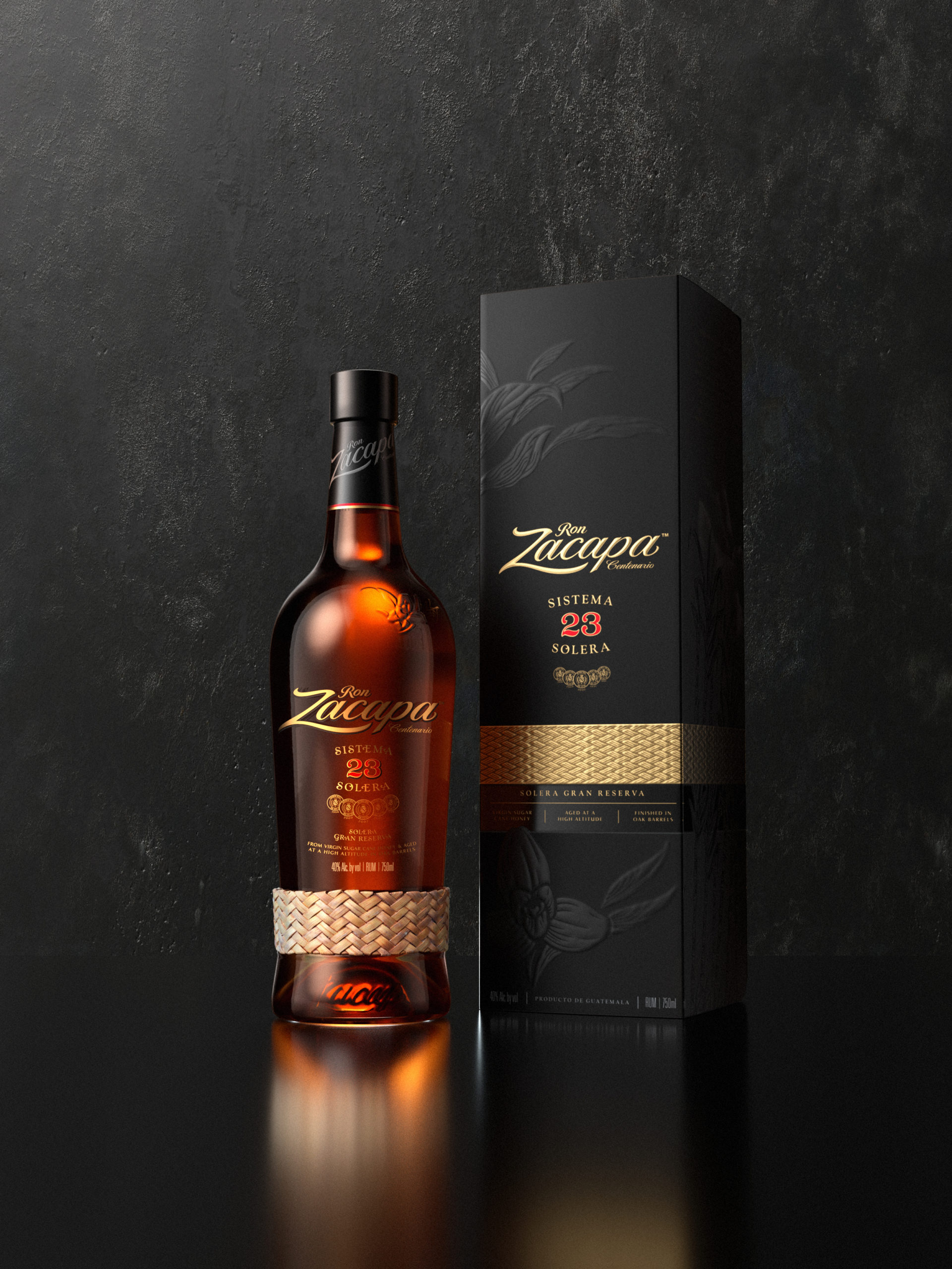
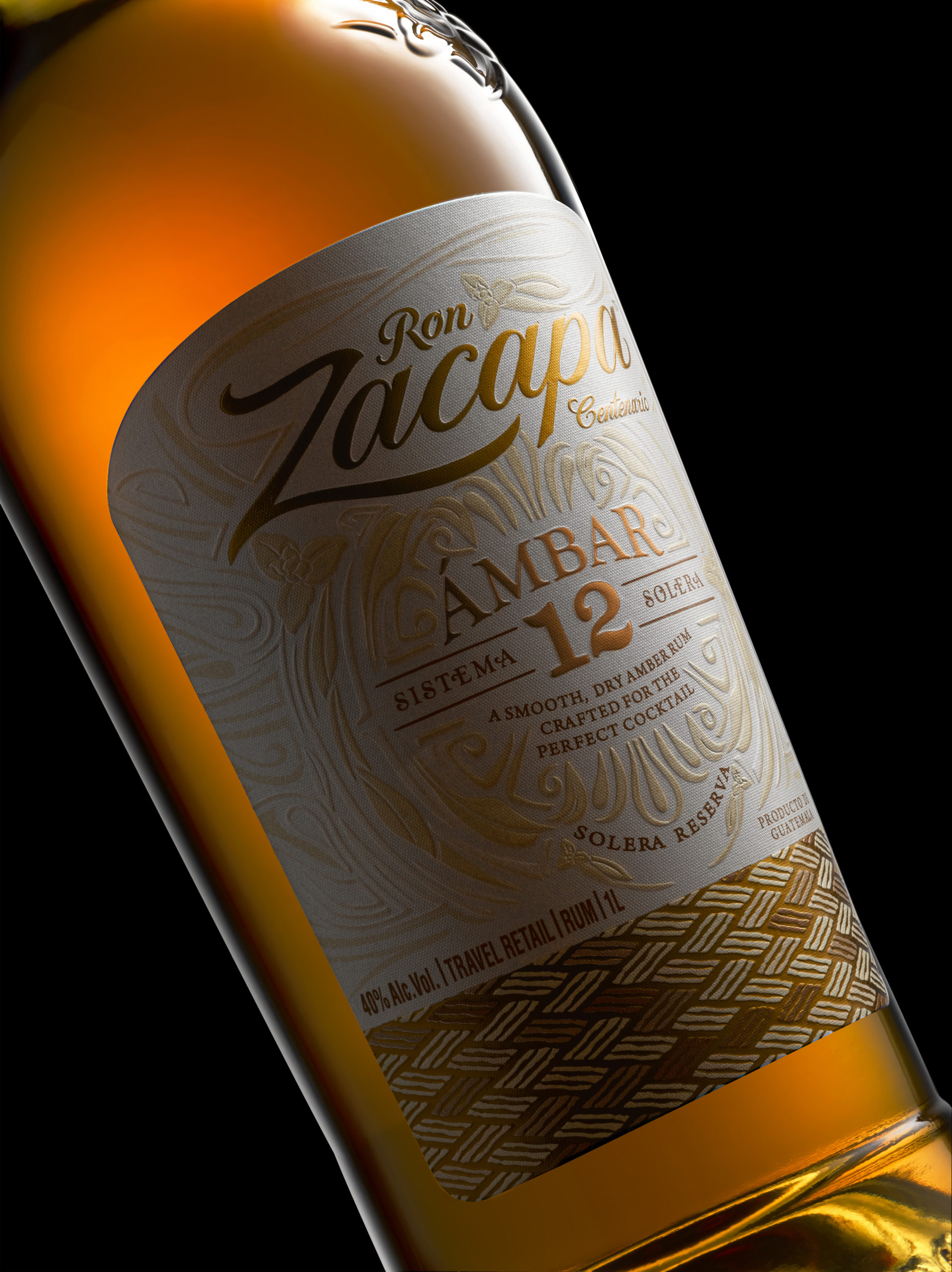
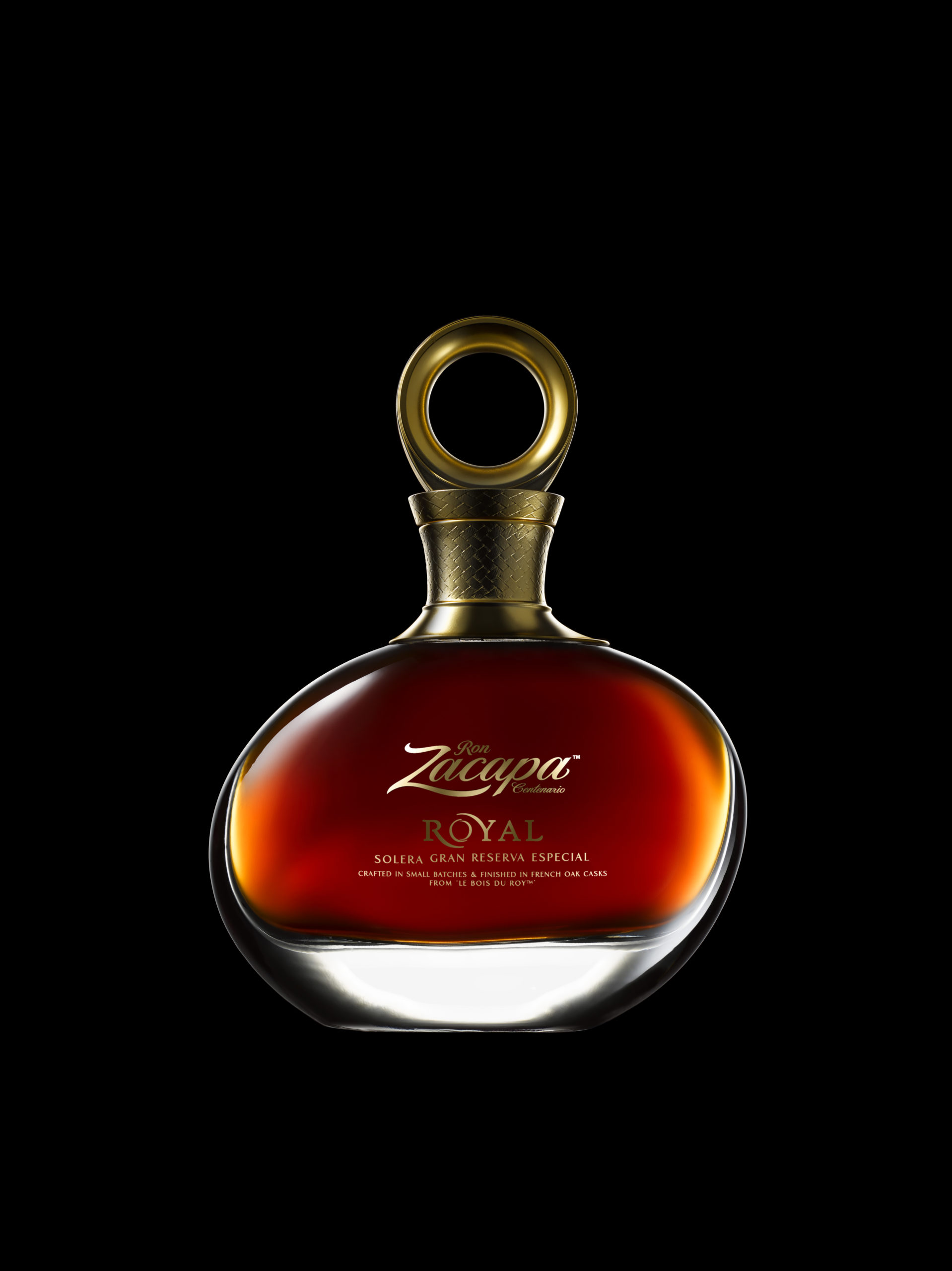
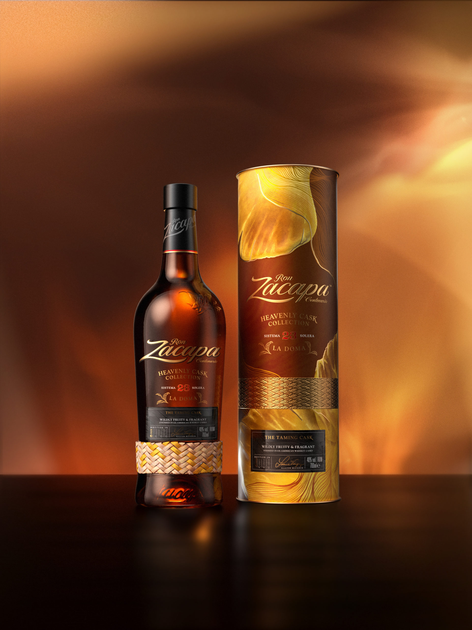
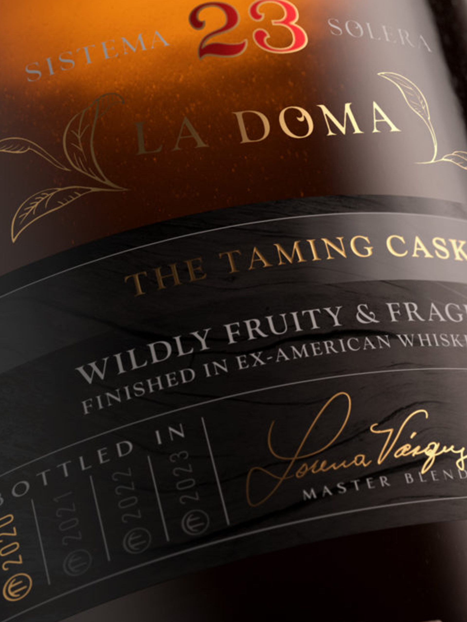
The packaging is the most tangible expression of the brand, the vessel that represents, holds, and delivers the liquid product. As a result, the bottle and the carton carry exquisite details that personify the craft that goes into the making of the rum. Each element is carefully considered to herald the brand both visually and physically and to tell the story of Zacapa.
Brand Renovation, Full Portfolio Redesign, Brand world, Bottle & Packaging Design, Limited Editions Design, Key visuals (Digital & Social), Retail Design.


