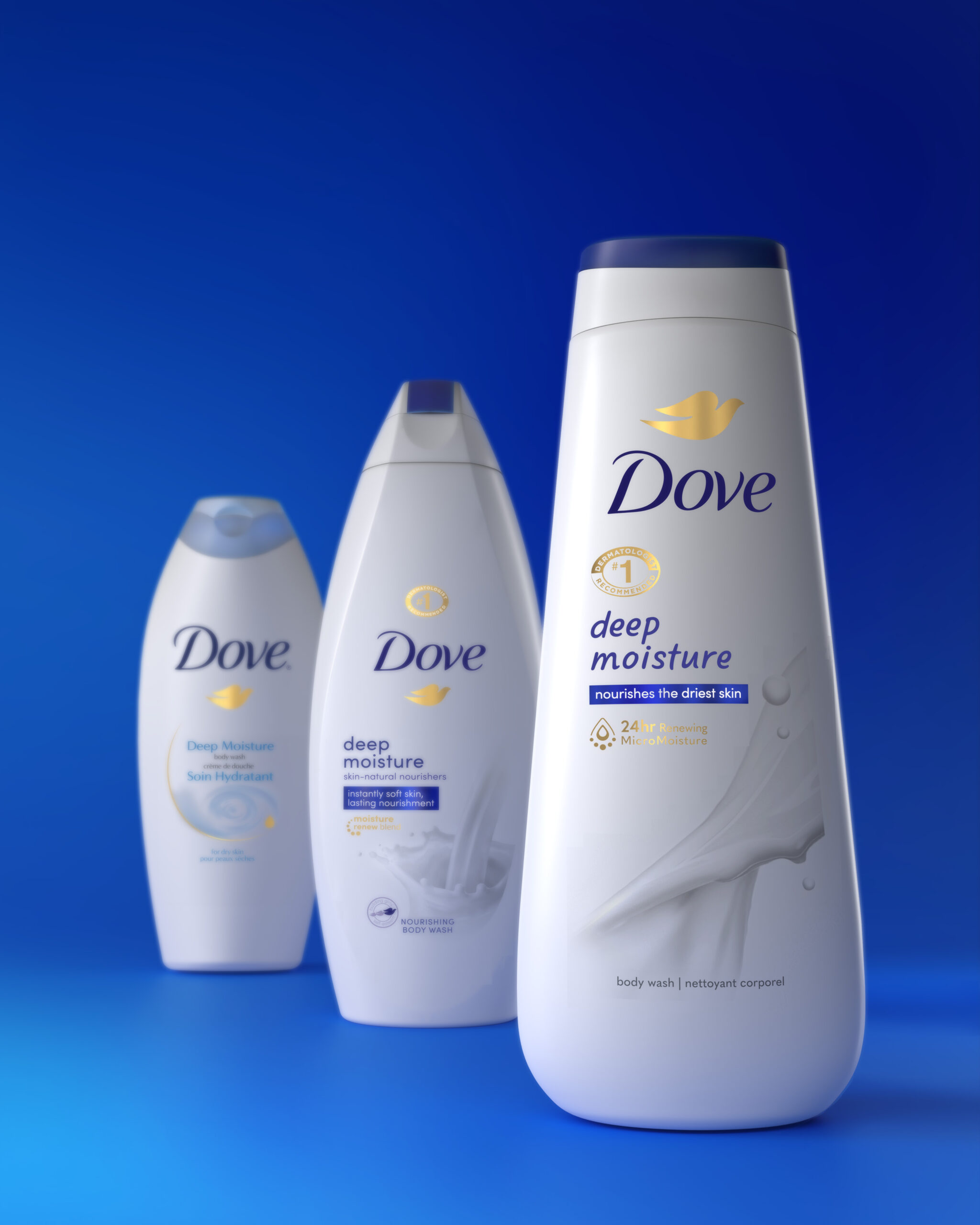
In a rapidly evolving and expanding market, consumers still reach for Dove Body Wash as the #1 body wash in the world. This redesign initiative introduces a new, modern, user-friendly bottle design that is Dove’s first upgrade to its iconic package in 17 years. And with the visual refresh also comes a new formulation, as this is Dove’s first vegan body wash.
In a major collaborative effort with Unilever Marketing, R&D, and supply chain, forceMAJEURE created a new-generation packaging that takes the fundamental essence of Dove’s brand design history, the Dove DNA, and brings about an organic evolution by redesigning the current bottle and elevating the visuals with a premium, indulgent look—all while looking to reduce plastic use as part of Dove’s sustainable ethos.
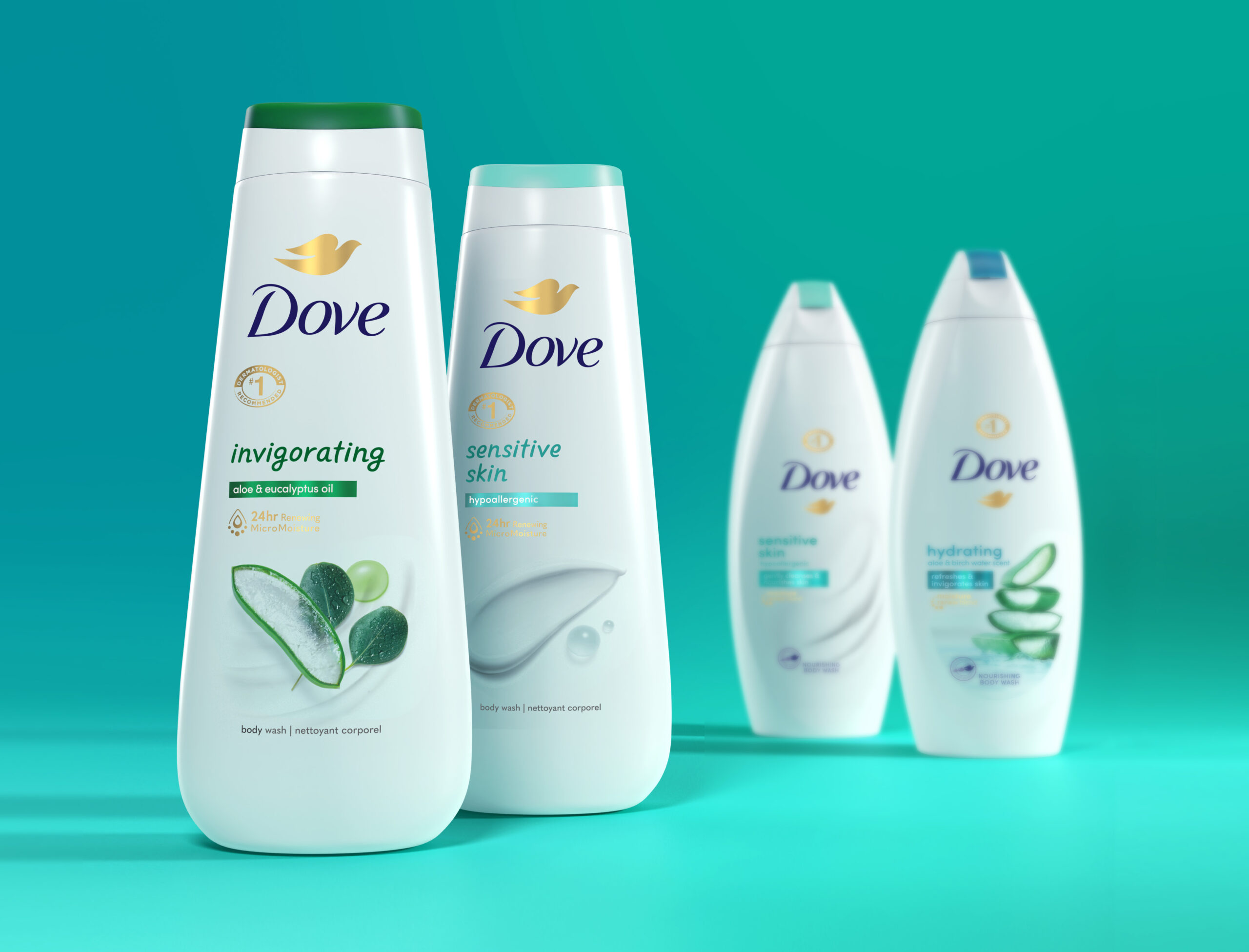
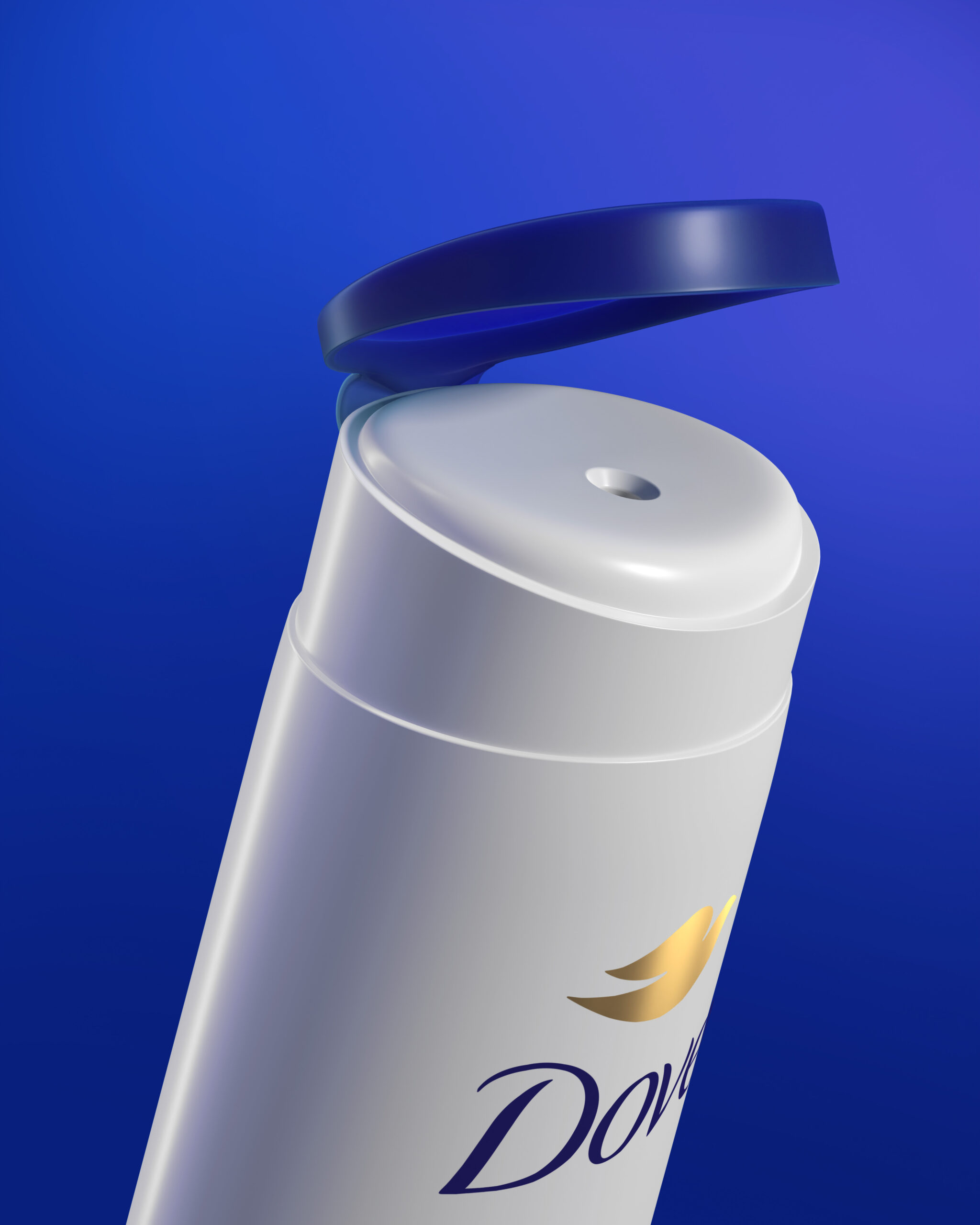
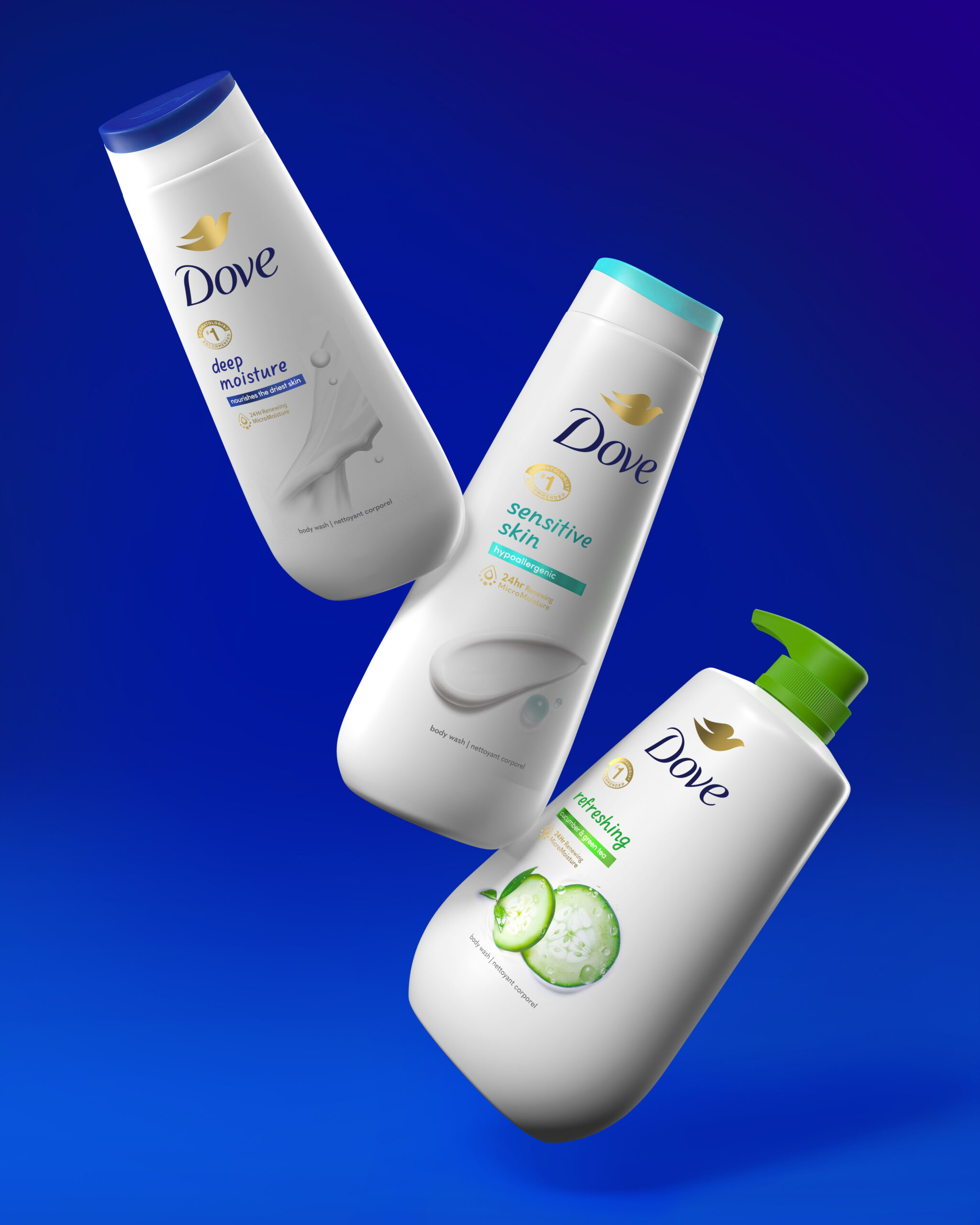
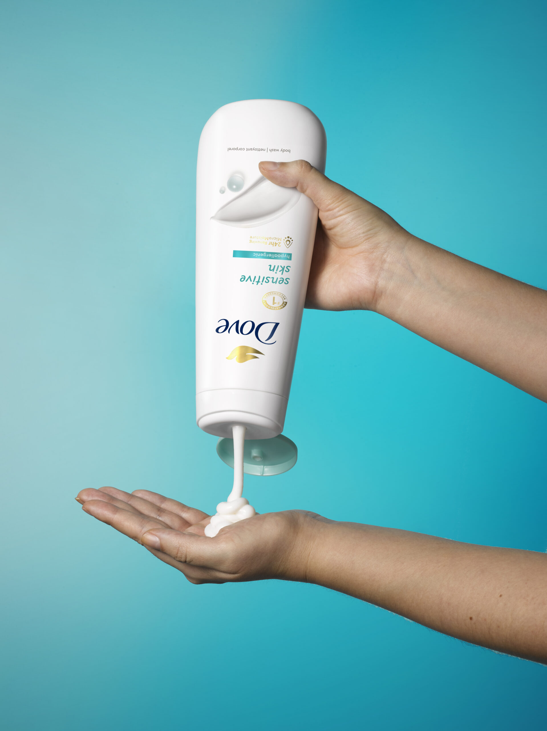
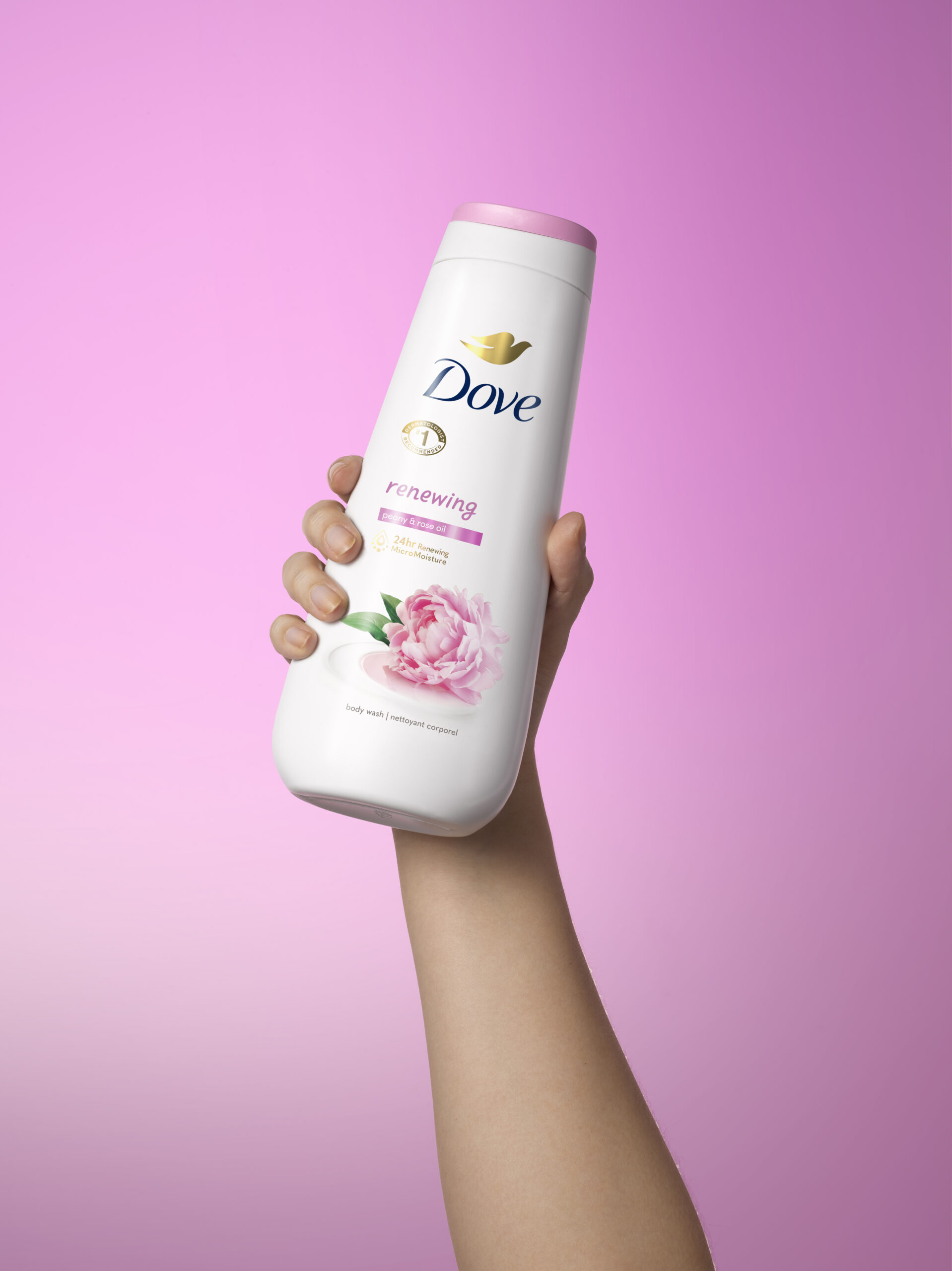
We designed the bottle’s shape to increase visual impact and iconicity, functionality, and modernity, taking cues from Dove’s unique DNA. The teardrop form of the previous pack has been streamlined, evolving into a slimmer, more shower-friendly profile. And the narrow cap has been replaced with an enclosure that is more functional, enveloping, and designed to resemble the shape of Dove’s original, iconic Beauty Bar. These ergonomic design changes allow users to hold the bottle, flip the cap, and dispense the product easily with only one hand. They also help the bottle stand upside down, making it more straightforward to use up as much of the product as possible.
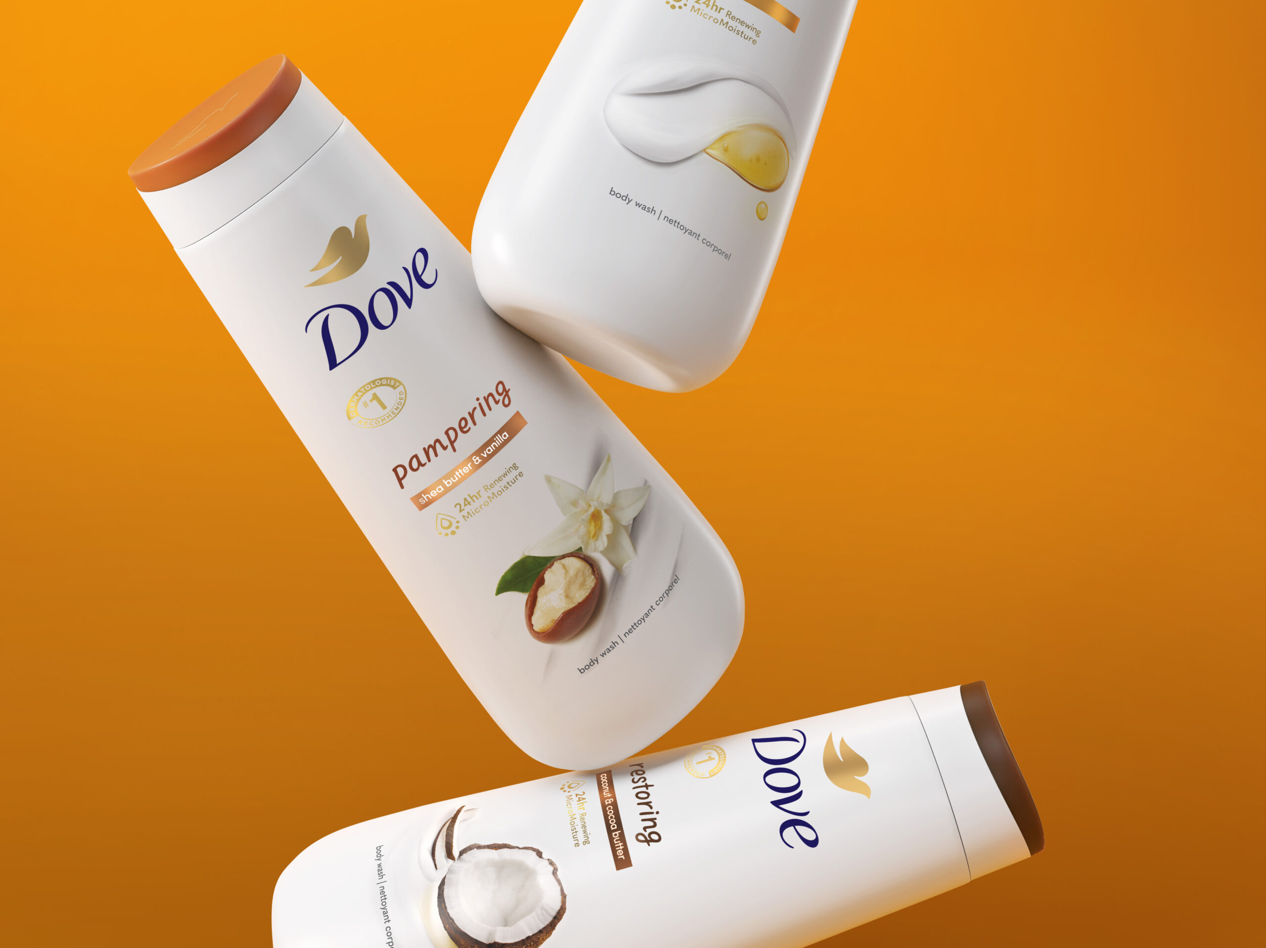
A key element that remains present in our redesign is the use of color-coded caps to aid in variant recognizability, an essential inclusion for a product with an 18-variant portfolio. With a more refined and prominent cap and a clear delineation between variants, this color coding significantly impacts variant recognition.
We updated the branding by creating a new brandmark lockup that places the bird icon above the Dove wordmark and increases its prominence and visibility. The layout improvement allows clear communication of the benefits and heroes of the product’s new formulation. The new layout also features a fully bilingual pack with English and French in North America. To bring expression, spirit, and warmth to each variant name, we created a bespoke handwritten typeface that brings joy and friendliness to each variant.
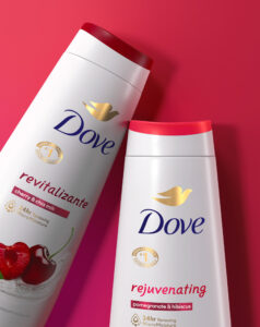
The star of the pack’s graphic is a new take on the beautiful ingredient imagery, featuring a photography and composition style that magnifies sensories and beauty cues as the brand evolves. We created unique product ingredient expressions for each variant within an ever-expanding portfolio of fragrance stories, combining the living warmth of nature with a dynamic balance of nourishing claims that are easy to read. The newest addition to this portfolio is a variant created explicitly for the Spanish-speaking market: “Revitalizante”—with cherry and chia milk—is the first Dove Body Wash in the US to launch with both English and Spanish copy on its bottle, reflecting Dove’s commitment to inclusivity straightening its global leadership as the #1 body wash in the world.
Every bottle is made from post-consumer recycled plastic, in line with Unilever’s new global commitments to address plastic waste by reducing virgin plastic use and plastic weight in packaging. In addition, with all moisturizing ingredients being plant-based, the focus on sustainability continues with the new formulation, which garnered PETA’s seal of approval as a cruelty-free vegan formula.
The evolution of Dove’s body wash is reflected in all critical elements of the pack: the communication of the innovative and ethically sourced formula, the upgraded branding and variant recognition color system, and the striking ingredient graphics that illustrate the story of each variant and serve as the focal point of each bottle. The new packaging embodies the evolution of Dove products, helping to carry the beloved brand into the next generation and continuing the tradition of skin cleansing superiority.
Packaging Design, Illustrations, Photography.


