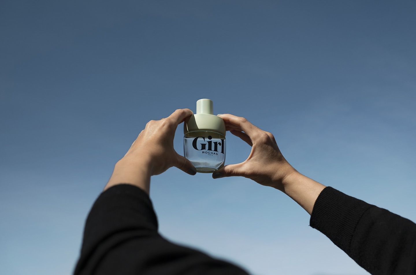
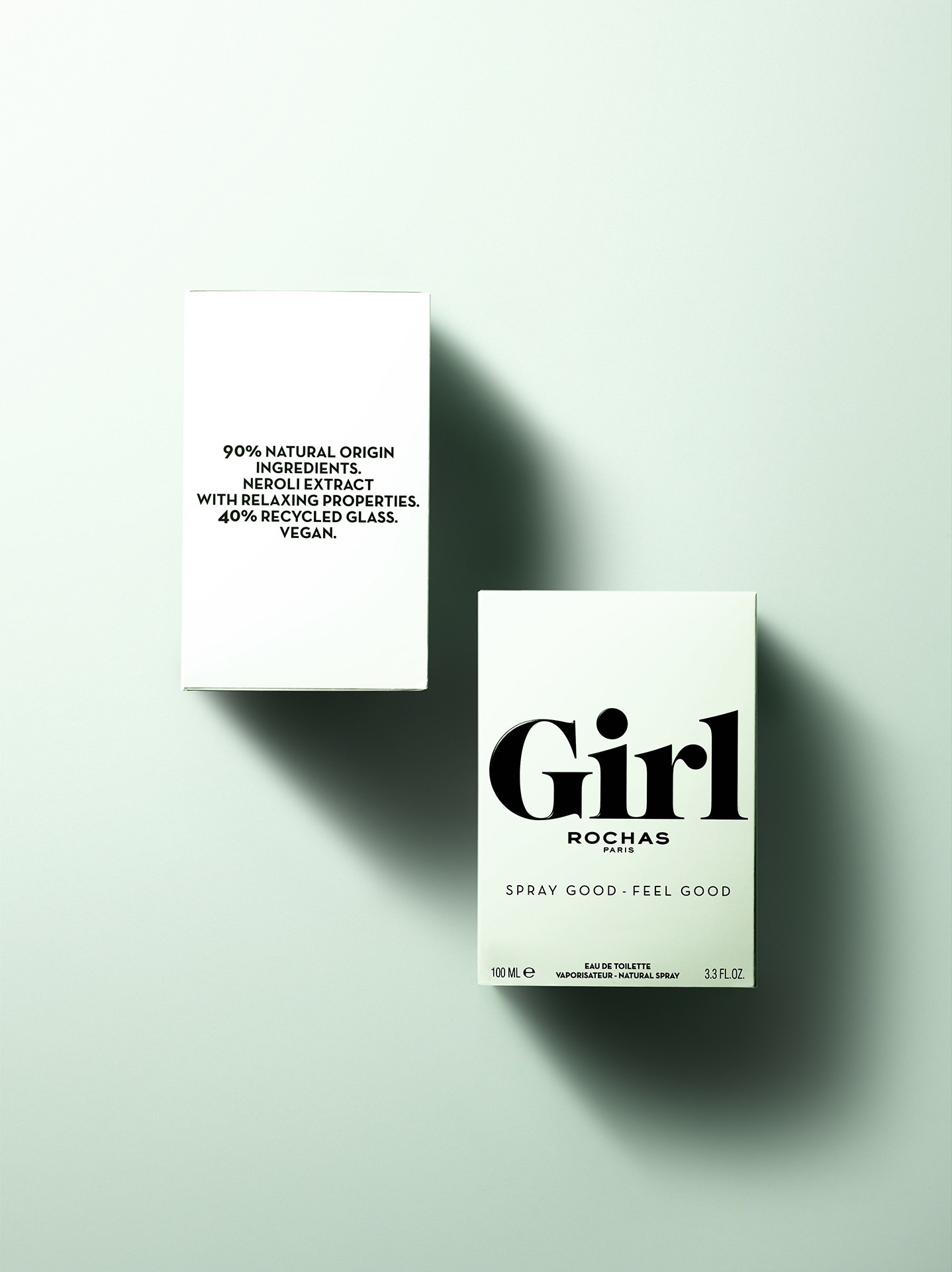
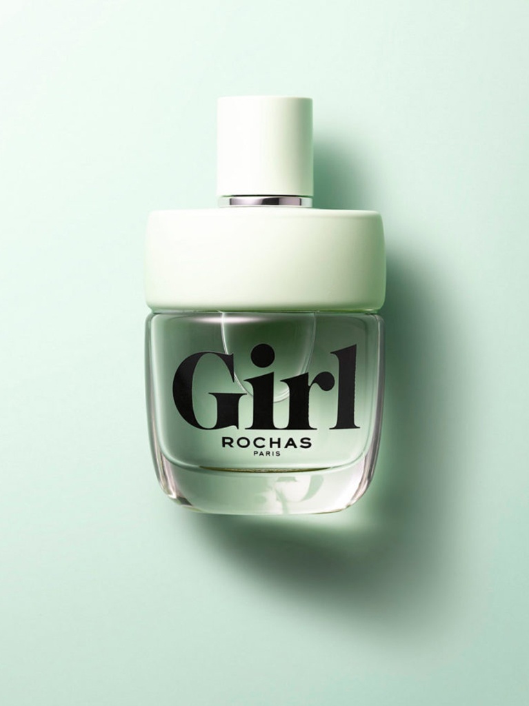
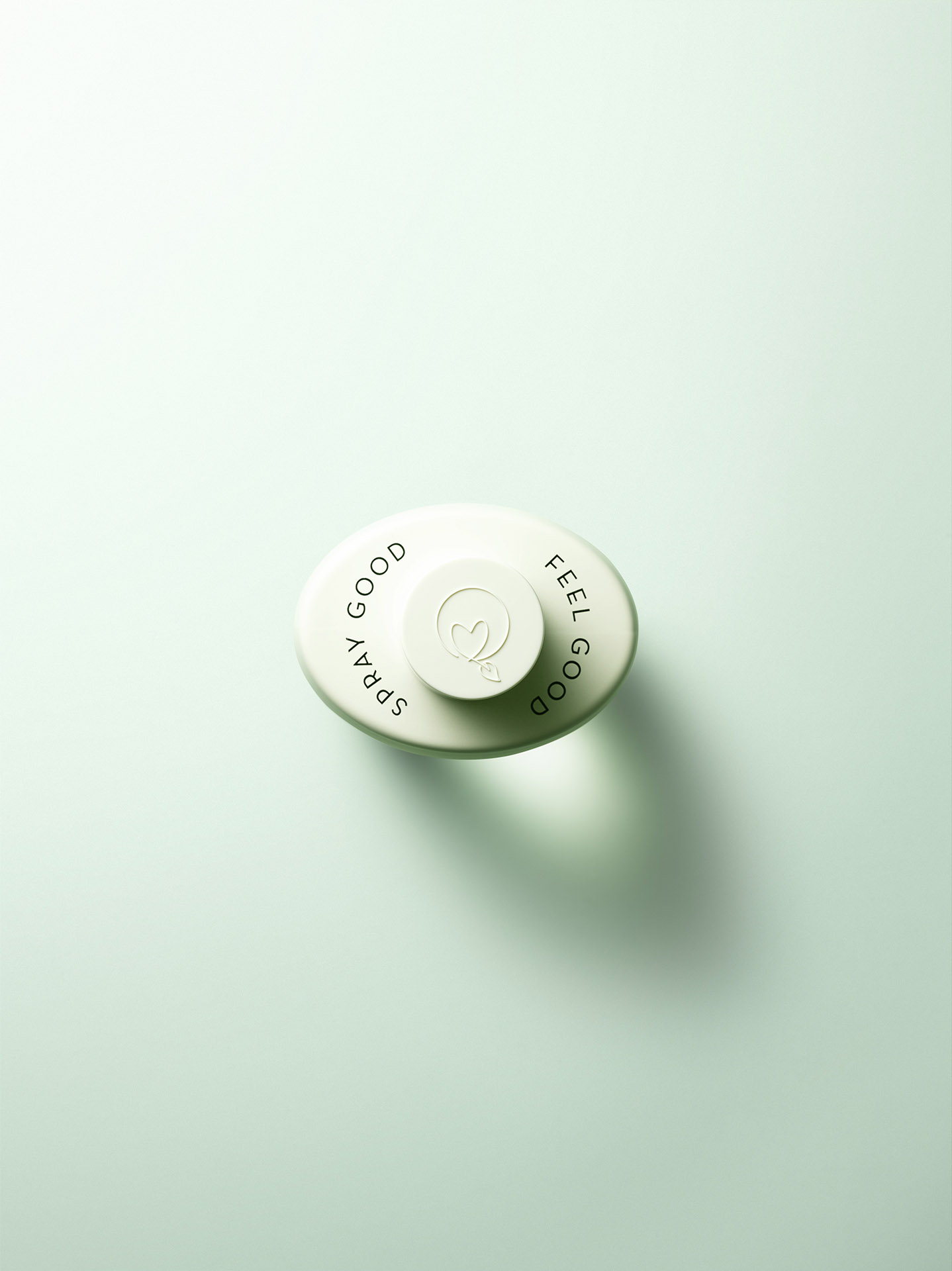
The Rochas team commissioned us to bring their new fragrance Girl to life through the creation of a unique visual identity and graphic design for the bottle and the packaging, successfully uniting a new generation of conscious femininity.
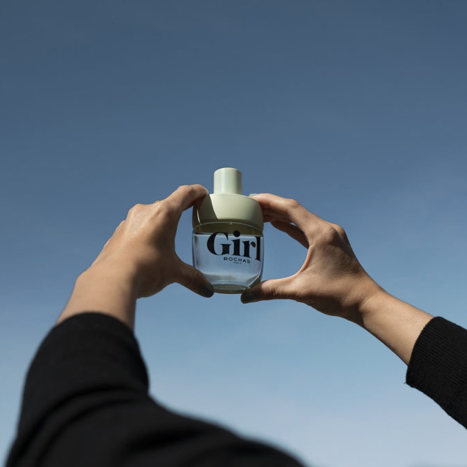
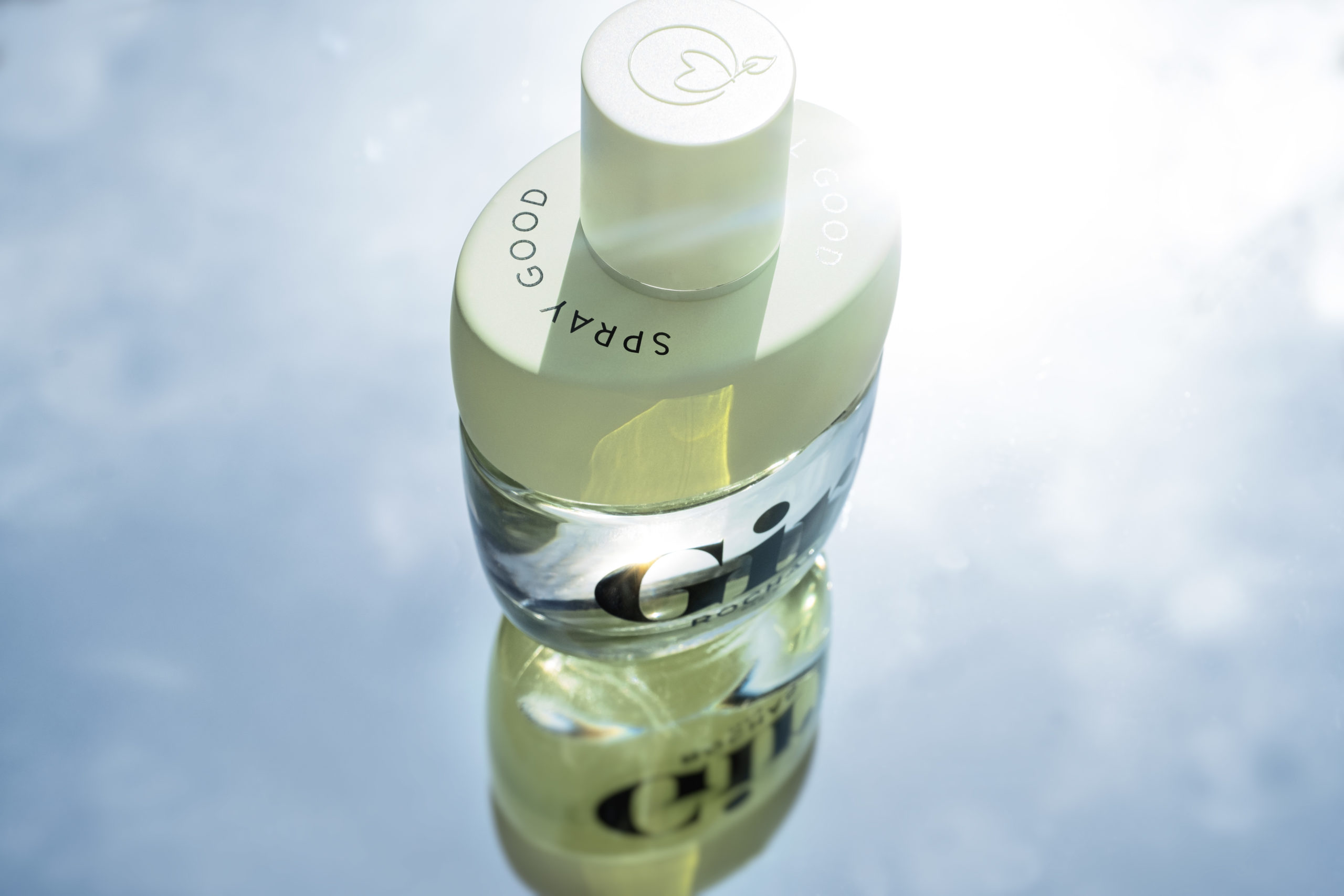
Our answer is an ode to freedom, joy and energy, celebrating a new inclusive mindset. The art direction embraces a blue sky full of hope, sunrise lighting and natural shadows, wind of change, natural off-white textures, no horizon-infinite possibilities and drama for action-low angle. We were tasked to create a modern and sophisticated design solution, expressed across the Girl’s visual identity and secondary packaging. A “less is more” approach with two bold colors, an inviting font for the logo, bringing a sense of trendiness and appeal to the luxury category codes while conveying a conscious and responsible mindset, which was a key element to Rochas target consumer.
Conveying a conscious and responsible mindset was a key element to Rochas target consumer. We focused on communicating the environmentally friendly approach of this project: 90% ingredients of natural origin in the liquid, and a packaging which comes without unnecessary components. The bottle is 100% made in France, composed of 40% PCR recycled glass from the collection of household glass containers, cutting back the carbon footprint by 9% and water consumption by 12% during production.
The choice of font for the logo brings a sense of trendiness and appeals to the luxury category codes.
Visual Identity, Graphic Design, Art Direction.


